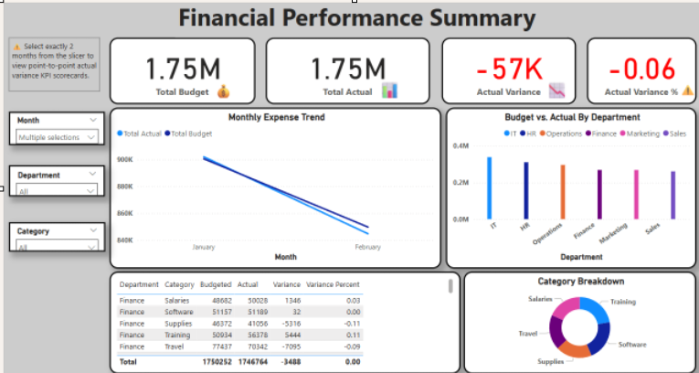
📊 Financial Performance Summary Dashboard
This dashboard provides a dynamic view of departmental financial performance, comparing budgeted versus actual expenses across time. Key features include:
KPI cards showing total budget, actuals, variance ($), and variance (%)
Smart slicers for filtering by month, department, and category
Point-to-point variance logic, comparing selected months dynamically
Conditional formatting on variance metrics for quick red/green insight
Interactive visuals: line chart for monthly trends, bar chart for department breakdown, and donut chart by category
Responsive layout: KPI metrics and supporting charts update instantly based on slicer inputs
Instructional note that only appears when comparing exactly two months
This dashboard demonstrates practical Power BI skills in DAX, user interaction design, dynamic visibility logic, and executive-level financial storytelling.