📊 Marketing Campaign Performance Dashboard
Tool: Tableau Public
Data Source: marketing_campaigns_large.csv (500 records, 14 fields)
Objective: Visualize and analyze marketing campaign performance across multiple digital channels using KPIs such as ROI, CPA, CPC, Conversion Rate, Impressions, Clicks, and Conversions.
🔧 Key Features and Visuals:
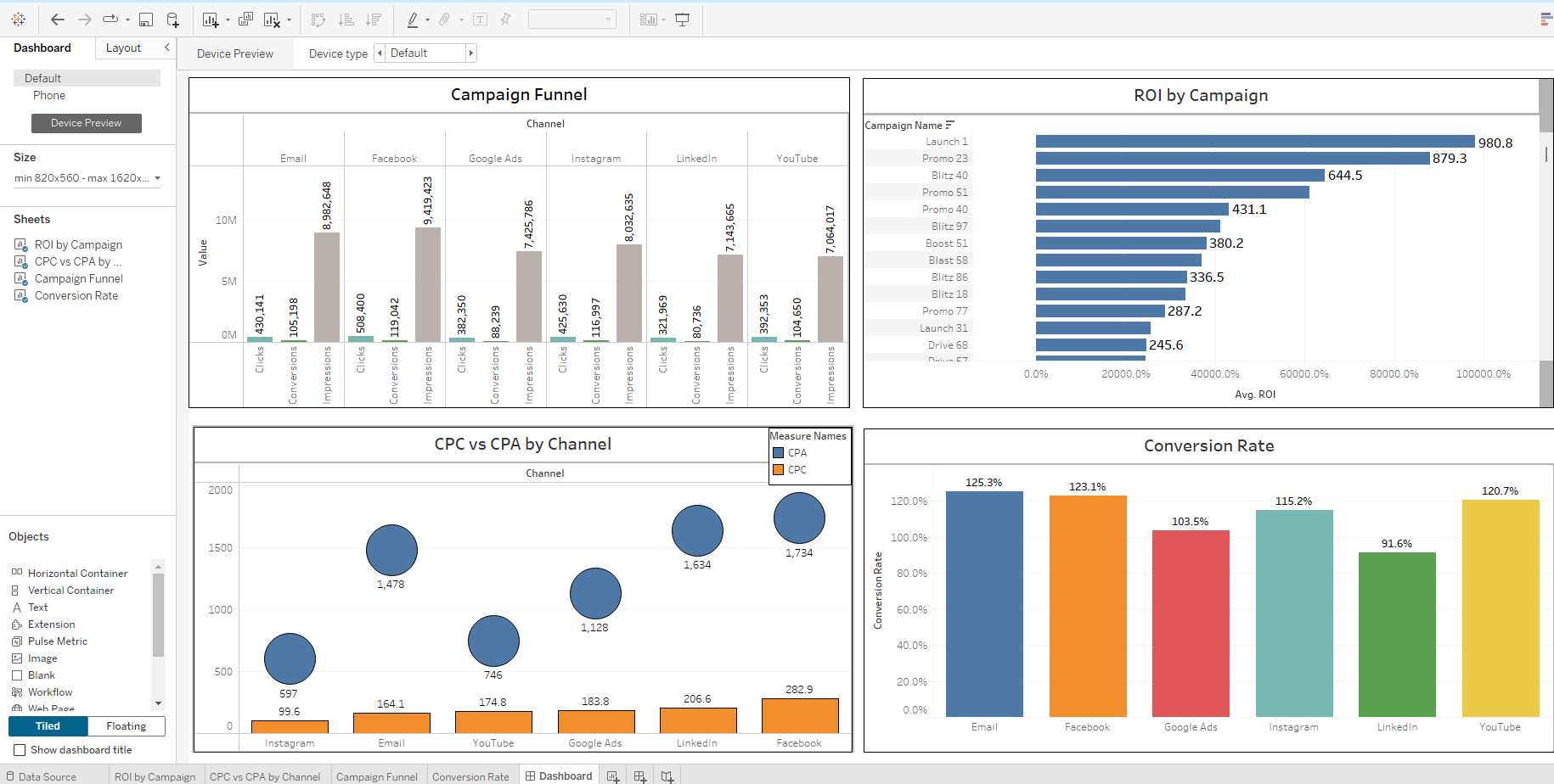
1. Campaign Funnel Visualization
Chart Type: Grouped vertical bar chart
Metrics Tracked: Impressions, Clicks, Conversions
Breakdown: Grouped by marketing channel (Email, Facebook, Google Ads, Instagram, LinkedIn, YouTube)
Purpose: Show the drop-off at each stage of the funnel for each channel and identify which channels perform best at converting impressions into actions.
Improvements: Conversion Rate was separated from this view for clarity due to visual clutter and differing scale.
2. Conversion Rate by Channel
Chart Type: Colored bar chart
Color: Each bar is uniquely colored by channel
Insight: Highlights top-performing platforms in terms of efficiency (conversion %), with Instagram, YouTube, and Email leading.
Formatting Fixes: Custom color assignments and label alignment for legibility and aesthetic improvement.
3. ROI by Campaign
Chart Type: Horizontal bar chart
Field Used: ROI calculated from (Revenue - Spend) / Spend * 100
Sorting Challenge: Tableau limitations on sorting calculated fields were resolved by adjusting the formula directly in the Data Source tab, making ROI behave like a native field.
Insight: Clearly shows the most and least efficient campaigns in terms of return on investment.
Tooltips & Labels: Simplified for readability. Precision was controlled to show rounded values to one or two decimal places for business communication.
4. CPC vs CPA by Channel
Chart Type: Dual-axis scatter/bubble chart
X-Axis: CPA
Y-Axis: CPC
Bubble Size: Conversions or Spend (varied for comparison)
Purpose: Visualize cost-efficiency between channels. Channels with low CPA and CPC are most efficient.
📌 Technical Challenges Overcome:
Sorting Calculated Fields: Tableau does not support sorting by table-calculated fields or aggregated measures easily. Fixed by creating a persistent ROI calculation in the Data Source tab instead of worksheet-level calculated fields.
Tooltip Bugs: Tooltip fields were rendering raw HTML tags. Switched to clean label formatting or removed faulty tooltips entirely.
Dashboard Layout Constraints: Worked within Tableau Public’s default “Tiled” layout, using floating objects strategically for alignment and spacing.
Color and Label Conflicts: Resolved overlapping label issues, inconsistent coloring, and axis misalignments that reduced data readability.
Aggregation Confusion: Tableau defaulted to aggregated views (AVG, SUM) for numeric fields; explicitly set proper aggregations and formatting to reflect business logic.
✅ Outcome & Value:
Created a functional, insightful dashboard to evaluate digital marketing efforts.
Highlights channel-level performance, cost metrics, and return efficiency across 500 campaigns.
Ideal for executives or marketing managers who want to quickly identify strong and weak performers.
Includes filters and consistent visual formatting for future scalability or parameterization.