📊 Healthcare Claims Analytics Dashboard
Key Features:
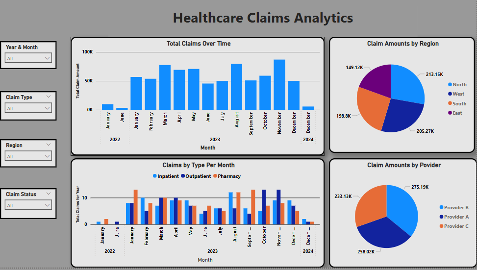
Total Claims Over Time:
A monthly bar chart showing fluctuations in total claim amounts throughout 2023, highlighting peaks in August and November.
Claim Amounts by Region:
A pie chart visualizing the distribution of claim costs across four geographic regions – North, South, East, and West. Each segment clearly shows the monetary amount and percentage of total claims.
Claims by Type Per Month:
A grouped bar chart breaking down the volume of claims by type – Inpatient, Outpatient, and Pharmacy – across all months, allowing for seasonality analysis and service mix evaluation.
Claim Amounts by Provider:
A pie chart displaying total claim costs attributed to each provider (Provider A, B, C), offering insight into provider utilization and spending patterns.
Interactive Filters:
Slicers on the right panel let users filter data by Year, Month, Claim Type, Region, and Claim Status (Paid/Denied), enabling customized, focused exploration.